Shortcodes
Fluxus theme comes with a handful of shortcodes. Use them in your posts and pages to embed extra functionality. The demo of all the shortcodes and their codes can be found on Fluxus Demo page.
Shortcode: Accordion
Accordion shortcode example:
[accordion]
[panel title="Page #1"]Nulla malesuada...[/panel]
[panel title="Page #2"]Pellentesque mattis...[/panel]
[panel title="Page #3"]Sed a sapien erat...[/panel]
[/accordion]
Shortcode: Alert
Alert shortcode example:
[alert]
Lorem ipsum dolor sit amet, consectetur adipiscing elit.
[/alert]
[alert type="note"]
Lorem ipsum dolor sit amet, consectetur adipiscing elit.
[/alert][alert type="success"]
Lorem ipsum dolor sit amet, consectetur adipiscing elit.
[/alert][alert type="warning"]
Lorem ipsum dolor sit amet, consectetur adipiscing elit.
[/alert]Shortcode: Aside
Any content wrapped in [aside][/aside] shortcode will be pushed to the right side of the page. It is useful when you wish to add some notes next to your main content. Use it like this:
This is your main content.
[aside]
This content will be shown on the right hand side.
[/aside]
Your main content continues.
Also [aside] shortcode supports position attribute, use it like this: [aside position="absolute"]. This will position aside content using CSS absolute position. If you’re not aware of what that means, it’s best just to check out the difference by trying it.
Shortcode: Buttons
Button shortcode supports three parameters:
- URL - the link that button points to.
- Style - button color, possible values are: yellow, blue, red, green, black.
- Size - if set to “big”, then the button will become bigger than the normal one.
Button shortcode examples
Normal buttons
[button url="#"]Button #1[/button]

[button url="#" style="yellow"]Button #2[/button]

[button url="#" style="blue"]Button #3[/button]

[button url="#" style="red"]Button #4[/button]

[button url="#" style="green"]Button #5[/button]

[button url="#" style="black"]Button #6[/button]
Big buttons
[button url="#" size="big"]Button #1[/button]

[button url="#" style="yellow" size="big"]Button #2[/button]

[button url="#" style="blue" size="big"]Button #3[/button]

[button url="#" style="red" size="big"]Button #4[/button]

[button url="#" style="green" size="big"]Button #5[/button]

[button url="#" style="black" size="big"]Button #6[/button]
Shortcode: Columns
Columns shortcode allows to split text content into multiple columns. Imagine that the content area is divided into 12 equal parts. By using columns shortcode you can specify how many parts should a column take.
For example, if you want to have two equal sized columns, then you need to use two columns with a size of 6. The code would be:
[columns]
[column6]
Content of the first column.
[/column6]
[column6]
Content of the second column.
[/column6]
[/columns]
If you want to have three columns of equal size, then you should use three columns with a size of 4.
[columns]

[column4]
Content of leftmost column.
[/column4]

[column4]
Content fo middle column.
[/column4]

[column4]
Content of rightmost column.
[/column4]

[/columns]
Troubleshooting issues
First make sure that the sum of column sizes is no more than 12. If the layout still seems broken, then try to delete space between column tags, for example if you have the following
[columns]

[column6]
Content of the first column.
[/column6]

[column6]
Content of the second column.
[/column6]
[/columns]
Change it into this:
[columns][column6]Content of the first column.[/column6]
[column6]Content of the second column.[/column6][/columns]
Galleries
Fluxus styles the standard WordPress galleries. The easiest way to include a gallery into the content is to add a Gallery block in the editor and upload or select existing images. The classic [gallery] shortcode is supported as well, see WordPress documentation for more info.
Show gallery photos in a Lightbox
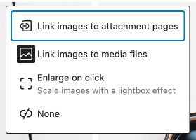 A gallery can specify where its photos should link to. Select the gallery block and click the Link icon in the block toolbar. Three options are available:
- Link images to attachment pages - this will link each gallery image to it’s attachment page.
- Link images to media files - this will open each image inside a Fluxus Lightbox.
- None - images will not be clickable.
Choose Link images to media files if you want to see your photos inside a Lightbox.
Shortcode: Services
Use services shortcode to create a nice looking layout accompanied with round pictures. The service shortcode looks best when used on a page with Full Width template.
Service shortcode parameters
- Title - title displayed above the image.
- Icon - the name of the icon that is going to be displayed on top of the image. The theme includes the Entypo icon set (several hundred icons). To see all available icon names open the css/icomoon.css file that comes with the theme: every
.icon-nameclass corresponds to an icon, use the part aftericon-with the service shortcode. - Image - URL pointing to an image. Usually you will upload an image using WordPress Media and get it’s URL from there.
The wrapping services shortcode also accepts a columns parameter (from 2 to 6), for example [services columns="3"]. If it is not provided, the number of columns is selected automatically based on the number of services.
Services shortcode example:
[services]

[service title="We Shoot" icon="camera" image="./camera.jpg"]
Pellentesque...
[button style="yellow"]More[/button]
[/service]

[service title="We Write" icon="pencil" image="./write.jpg"]
Pellentesque...
[button style="yellow"]More[/button]
[/service]

[service title="We Think" icon="light-bulb" image="./think.jpg"]
Pellentesque...
[button style="yellow"]More[/button]
[/service]

[service title="We Grow" icon="line-graph" image="./grow.jpg"]
Pellentesque...
[button style="yellow"]More[/button]
[/service]

[/services]
Shortcode: Social Icon
Use social icon shortcode to embed little links to social networks.
Supported Parameters
- URL - link to your social network profile.
- Icon - icon name.
Supported Icon Names
Icon names come from the Entypo icon set bundled with the theme. The full list is in the css/icomoon.css file, every .icon-name class corresponds to an icon name. The most useful social ones are shown below.
Social Icon example code:
[social icon="500px" url="#" /]
[social icon="behance" url="#" /]
[social icon="bluesky" url="#" /]
[social icon="dribbble" url="#" /]
[social icon="dropbox" url="#" /]
[social icon="facebook" url="#" /]
[social icon="flickr" url="#" /]
[social icon="github" url="#" /]
[social icon="google" url="#" /]
[social icon="instagram" url="#" /]
[social icon="lastfm" url="#" /]
[social icon="linkedin" url="#" /]
[social icon="patreon" url="#" /]
[social icon="paypal" url="#" /]
[social icon="pinterest" url="#" /]
[social icon="skype" url="#" /]
[social icon="soundcloud" url="#" /]
[social icon="spotify" url="#" /]
[social icon="tumblr" url="#" /]
[social icon="twitter" url="#" /]
[social icon="vimeo" url="#" /]
[social icon="vk" url="#" /]
[social icon="youtube" url="#" /]
Icons in circles: most social icons also have a version enclosed in a circle. Append -with-circle to the icon name:
[social icon="facebook-with-circle" url="#" /]
[social icon="instagram-with-circle" url="#" /]
[social icon="twitter-with-circle" url="#" /]
[social icon="youtube-with-circle" url="#" /]
Shortcode: Tabs
Tab shortcode example:
[tabs]

[tab title="First Tab"]
Aenean...
[/tab]

[tab title="Second Tab"]
Lorem ipsum...
[/tab]

[tab title="Third Tab"]
Ut vehicula
[/tab]

[/tabs]
Shortcode: Standfirst
Standfirst shortcode simply increases the font size of the wrapped text. Example usage:
[standfirst]
Increase the paragraph's font size with standfirst shortcode.
[/standfirst]
Shortcode: Raw
Content wrapped in [raw][/raw] shortcode will not be processed for other shortcodes. Use it when you need to display shortcode examples as plain text.
Shortcode: Break
Use break shortcode to insert a tiny horizontal line. It can be used for separating content. Shortcode example:
Content before separator.
[break]
Content after separator.