Fluxus theme is translatable using .po and .mo files, which is the official way of translating WordPress themes and plugins. This is a brief guide that explains how to translate Fluxus theme into German.
When using WordPress 4.0 or newer
Before starting make sure you have downloaded a free tool POEdit. It is available for both OS X and Windows.
1. Using FTP client connect to your website and download English translations file that was included with Fluxus theme. Find it under: wp-content/themes/fluxus/languages/en_US.pot
2. On your local computer rename the en_US.pot file de_DE.po (the convention is: language code followed by “_” followed by country code in capital letters).
3. Open de_DE.po file with POEdit and use it to translate the strings. For testing things out you can simply translate “Oops! That page can’t be found.” into something else.
4. When done translating save the file. POEdit will save the translations to de_DE.po and in addition it will generate a de_DE.mo which will be used by WordPress.
5. Upload de_DE.mo to wp-content/themes/fluxus/languages/de_DE.mo
6. The translations are there, now we need to tell WordPress to use the new German language. The easiest way is to upload a copy of our de_DE.mo file to wp-content/languages/de_DE.mo (create that folder if it doesn’t exists). Then login to WordPress Admin section and go to Settings > General on the bottom there is “Site Language” setting. Change it to “Deutsch” and click “Save Changes”. Go to your website and visit any non-existing page eg. example.com/this-surely-doesnt-exist (or more likely example.com/asdasdasd) instead “Oops! That page can’t be found” you should now see the string that you’ve added via POEdit.
7. Your site now should be displaying some strings that you’ve entered in step #3. Further edit de_DE.po file to translate more strings and repeat the #4 and #5 steps to upload your translations.
When using WordPress 3.X
1. Using FTP client connect to your website and download default.po file from Fluxus theme’s languages folder. You should find it under wp-content/themes/fluxus/languages
2. On your local computer rename the default.po file to something that would represent your language, in our case it could be de.po (hence DE is for Deutschland). Now we need to translate the de.po file.
3. Download translation program POEdit.
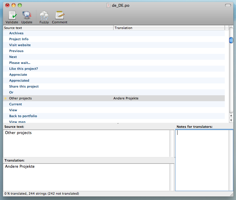 4. Use POEdit to open the de.po file. After opening you should see lots of strings, for a start let’s translate only one. Find a string that says “Other projects”, click on it and provide translation into your language. Save the file.
5. After saving you should see another file called de.mo. This is the file that got generated after saving the .po file. Let’s upload this de.mo file to wp-content/themes/fluxus/languages
6. The final step is to tell WordPress which language file to use. For this you will need to modify your wp-config.php. Find a line that says define(‘WPLANG’, ”); and change it into the file name of your .mo file (without extension). In our case it is define(‘WPLANG’, ‘de’);
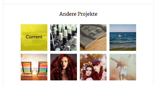 That’s it. Now try going to your portfolio project and look for a place that used to say “Other Projects”. It should read whatever translation you’ve entered using POEdit.
If you are new to WordPress then this translation method might look too difficult (I must admit it is not very user friendly). In that case you might want to read official WordPress documentation to get other more extensive solutions.

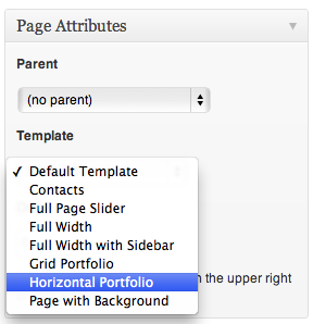 Create a new page by going to Pages > Add New, specify the name and locate Template select box. Select the template according to the type of Portfolio you would like to use (Horizontal Portfolio or Grid Portfolio). You can change it anytime. Publish the page and head to Portfolio section of this documentation to find out how to add portfolio items.
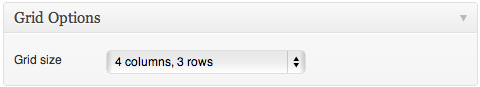 Arranges your projects in a predefined grid. If you have less than 12 projects, you might want to use a bigger grid. You can change the grid size by going to Pages and editing the page which has Grid Portfolio set as it’s template. On the bottom of the page there is Grid Options box, which allows you to specify custom grid size.
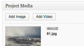 To add images find the Project Media box on the bottom of the project edit page. Click Add Image button. Media browser will open where you can select an existing images or upload a new ones. Choose an image and click Add Image(s) button.
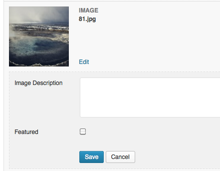 To feature an image or video, find it in Project Media list and click edit. Check the Featured checkbox and click Save. Only one featured item per project is possible, so featuring an item will “un-feature” any other media items in that particular project.
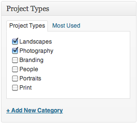 You can assign project types to your project on a project edit screen. Go to Portfolio, choose the project you wish to edit or create a new one. On the right hand side there is Project Types widget, where you can choose relevant project types.
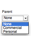 This can be done using hierarchical project types. Go to Portfolio > Project Types and create 2 project types named Personal and Commercial. Next create 4 more project types Travels, Experiments, Fashion and Weddings and make sure you assign their parent setting to either Personal or Commercial project type.
Shortcode: Social Icon
Use social icon shortcode to embed little links to social networks.
Supported Parameters
Supported Icon Names
Social Icon example code: